The reel

Five builds

Every site carries our name.

Each site we ship links back here from its footer, so the work has to hold up every day without us in the room. One of these is live; four are concept builds. We keep the names off them — what's worth looking at is the thinking, not the logo in the corner. The live one has a full write-up of the decisions behind it.

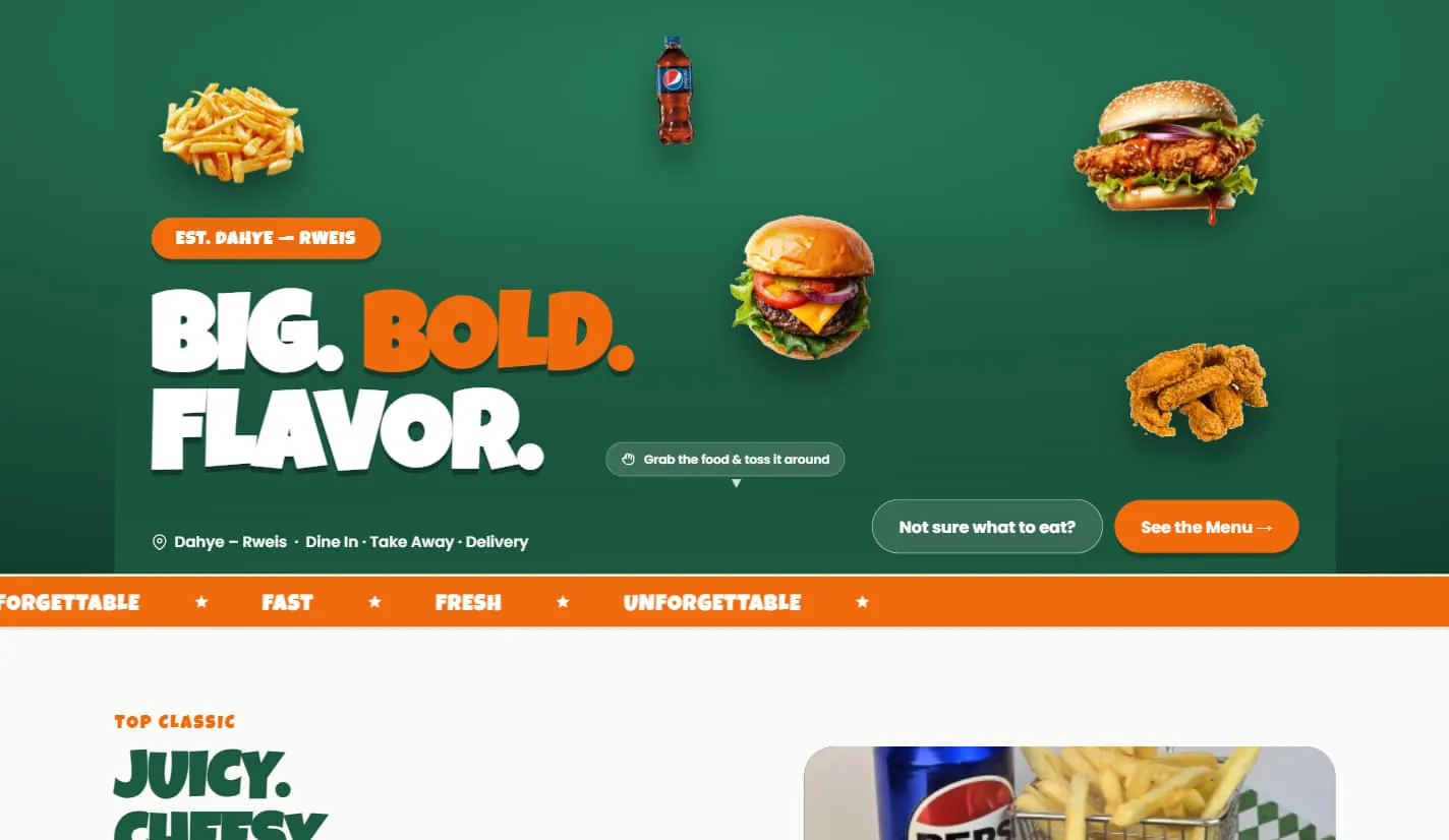
Burger shop homepage: “Big. Bold. Flavor.” in heavy white and orange type on deep green, with cut-out photos of fries, burgers and fried chicken floating around it, a See the Menu button, and an orange Fast · Fresh · Unforgettable ticker across the bottom.
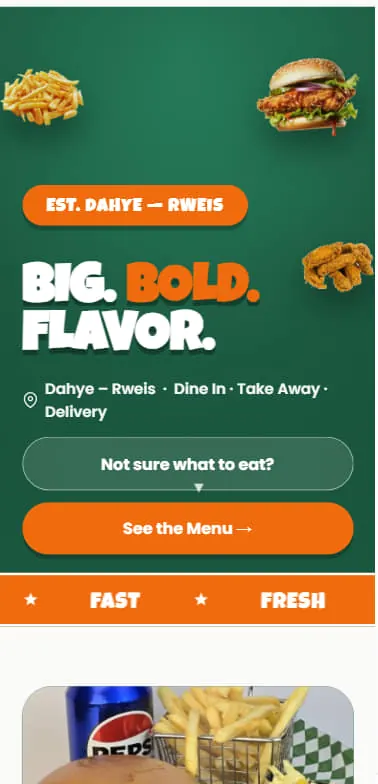
The same burger shop homepage on a phone, headline stacked to two lines and the Not sure what to eat and See the Menu buttons widened to fill the screen.
SC. 01Live

A burger shop that had to look hungry

Loud brand, playful motion, and a menu you can order from in two taps. Built to survive being opened one-handed on a phone outside the shop.
  • Ordering flow
  • Menu system
  • Mobile-first
Read the case study →
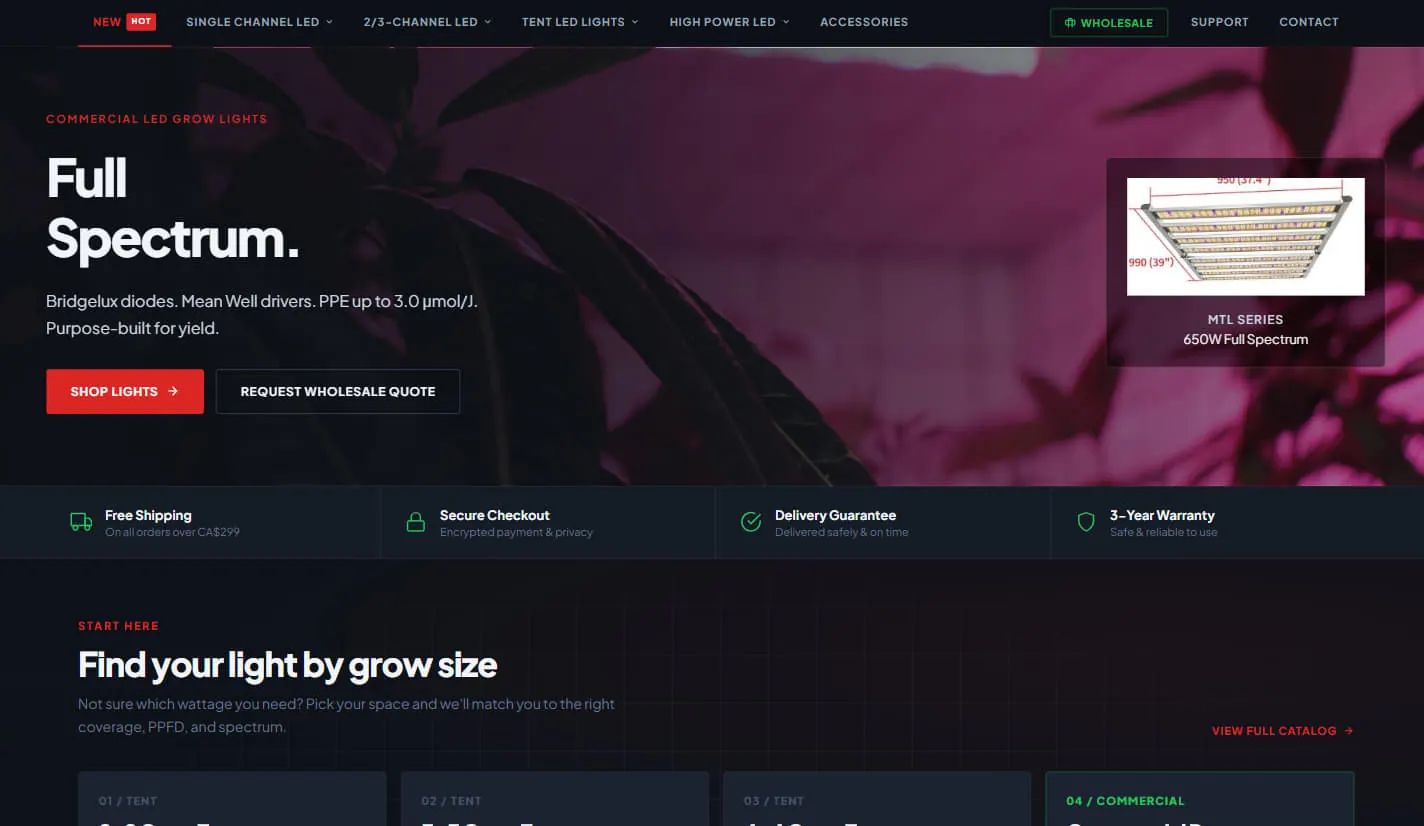
Dark LED grow light store: “Full Spectrum.” set over a magenta-lit plant photo, a spec line naming Bridgelux diodes and Mean Well drivers, Shop Lights and Request Wholesale Quote buttons, a 650W product card, and a row of shipping, checkout, delivery and warranty guarantees.
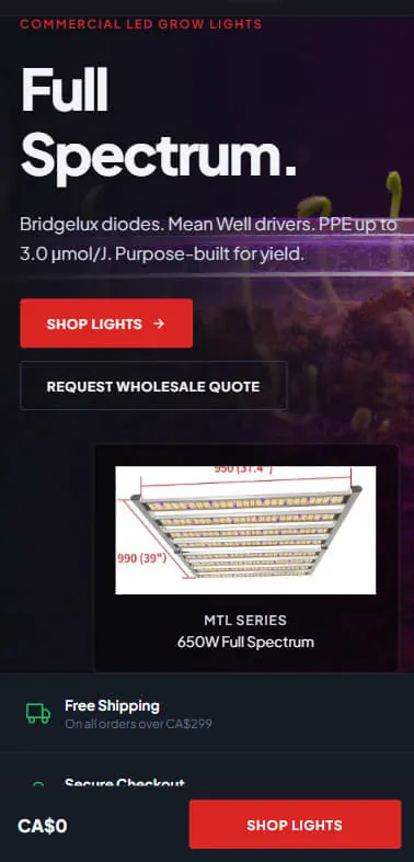
The grow light store on a phone, with the product card moved below the buttons and a sticky bar at the bottom showing a running CA$0 total beside a Shop Lights button.
SC. 02Concept build

A technical catalogue for people who read spec sheets

Hundreds of products, filtered by the numbers buyers actually shop on. Dark, dense, and fast — the specs do the selling, so the layout gets out of the way.
  • Catalogue
  • Spec filtering
  • Wholesale path
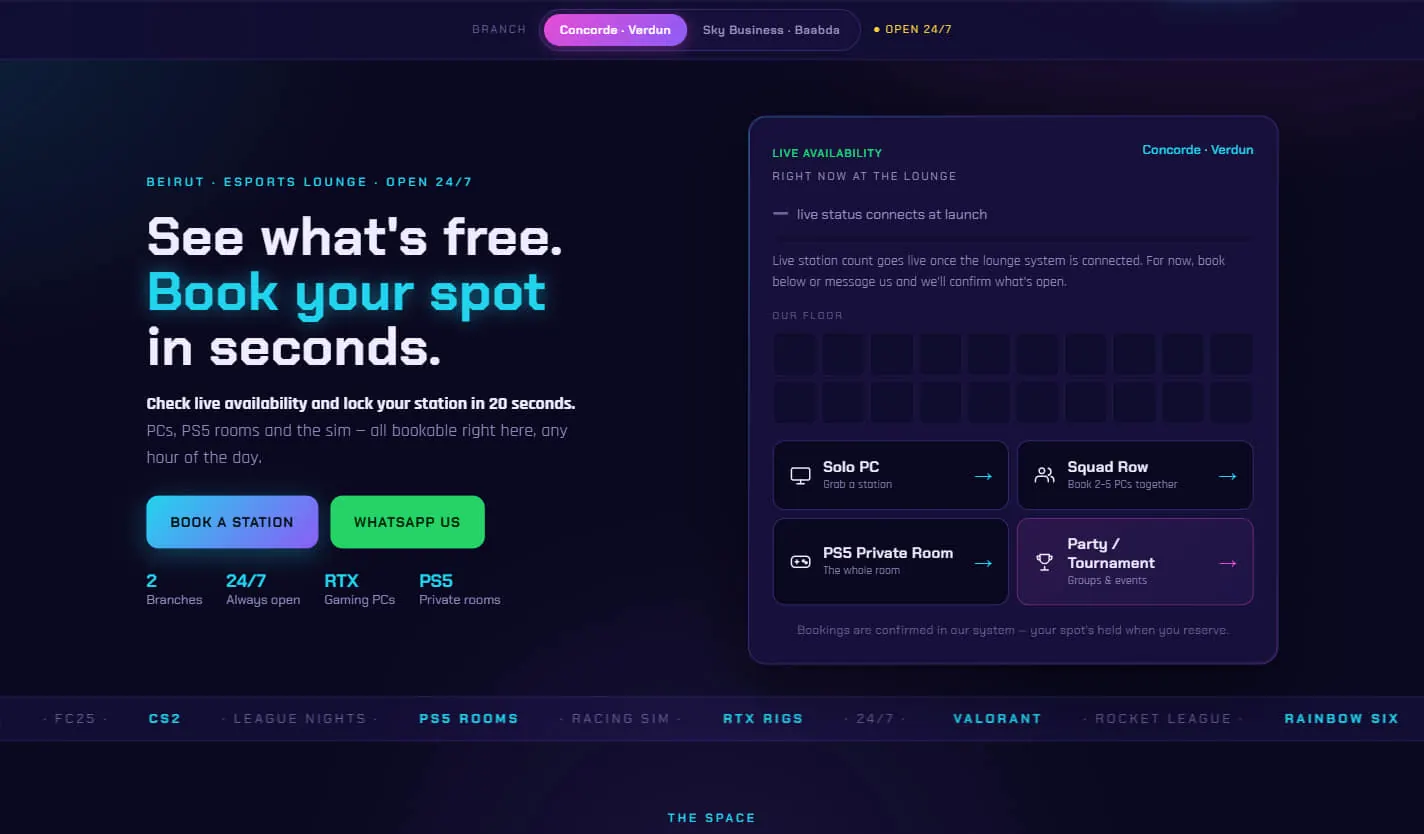
Esports lounge booking page in neon blue and purple on near-black: “See what’s free. Book your spot in seconds.” beside a Live Availability panel showing a floor map of stations and four booking options — Solo PC, Squad Row, PS5 Private Room and Party / Tournament.
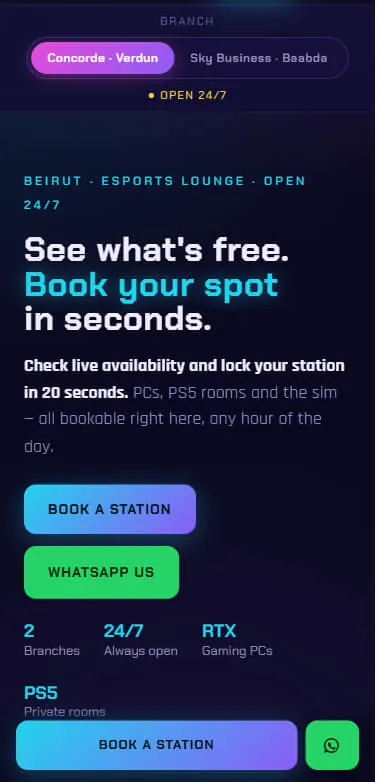
The esports lounge page on a phone, branch switcher pinned at the top, stacked Book a Station and WhatsApp Us buttons, and a sticky booking bar with a WhatsApp button at the bottom.
SC. 03Concept build

A booking page built for someone standing in a queue

Availability up front, booking in under a minute. High-energy palette, but every decision points at one button.
  • Live availability
  • Booking
  • Two locations
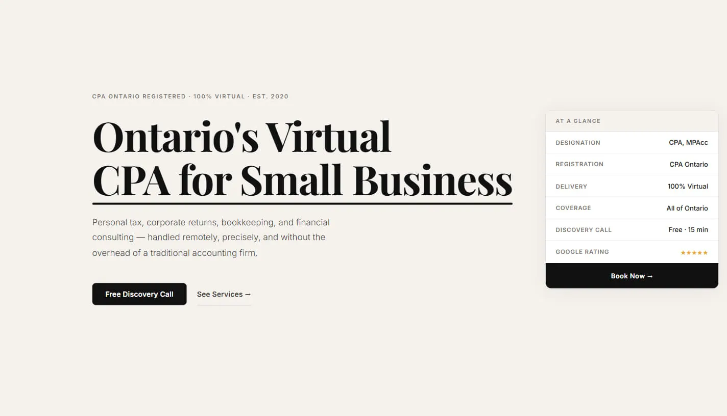
Accounting practice site on warm off-white: “Ontario’s Virtual CPA for Small Business” in large underlined serif type, beside an At a Glance panel listing designation, registration, coverage, a free 15-minute discovery call and a five-star Google rating above a Book Now button.
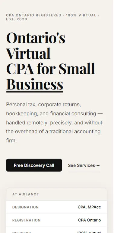
The CPA site on a phone, headline broken across four lines with the At a Glance credentials panel pushed below the Free Discovery Call button.
SC. 04Concept build

A professional practice that had to earn trust fast

Editorial type, a lot of white space, credentials visible without scrolling. Quiet on purpose — the whole page is an argument for competence.
  • Credibility layout
  • Discovery call
  • Service pages
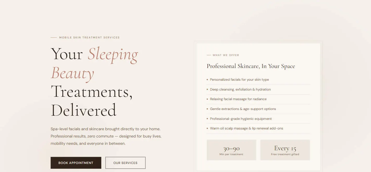
At-home skincare service site in soft cream and rose: “Your Sleeping Beauty Treatments, Delivered” in serif type with an italic accent, beside a What We Offer panel listing six treatments and two tiles reading 30–90 minutes per treatment and a free treatment every 15.
SC. 05Concept build

A calm, high-touch service brand

Soft palette, generous spacing, and an offer you understand in one screen. Everything is arranged around booking an appointment without feeling sold to.

  • Brand direction
  • Service menu
  • Booking

The next one could be yours.

We take a small number of builds at a time. If you want one of them, the first step is a conversation — not a proposal.